I'm Rahul Mukherjee.
I make data and visual stories. I've built explainers how satellites work, showed the impact of climate change on the globe, and helped people budget their streaming services.
You can see some of my other work from the L.A. Times, Axios, or scroll down below ↓
Finding the Big Bang
Visual story explaining the James Webb and it's mission. Designed, reported, coded, and 3d modeled.
How Lunisolar Calender Guide Cultures
Illustrated story I designed, developed, and reported about why cultural calendar have different dates.
Streaming Optimizer
News application that tells users when they should subcribe to their service to find their favorite tv shows. Conceptualized, Designed, and developed.
Spotify vs. the Grammys. How do they Differ?
I analyzed how Grammys winners stayed popular compared to nominees. I designed and developed a visualization along with it.
El Niño's Global Impact
Story I helped write, design and develop about how El Niño could affect global weather patterns.
Extreme Heat Threatens Future Summer Olympics
Visual story I designed, wrote and helped develop about how high heat will impact athletics, particually the Olympics.
California's congressional districts
Breaking news story I reported and built. Application used to help readers understand where their new voting distrcits are.
Pro sports teams are starting to get rid of racist names. Hundreds of U.S. high schools still have them
I scrapped websites and used machine learning on team logos to determine how many high schools have Native American mascots in their name.
Biden and Trump offer Latino voters different visions of America — and of each other
I helped analyze Facebook data and build a presentation showing what Spanish ads were aired and who they were targeted at.
Why it takes women longer to get into the Rock and Roll Hall of Fame
I helped report, design, and develop a visual story about why it takes women to get inducted in the Rock and Roll Hall of Fame.
Your sports craving guide
I compled a list of content from online sources and from our writers, and built a quiz to see what readers should watch during the COVID pandemic.
How many mass shootings might have been prevented by stronger gun laws?
I looked at the Violence Project's mass shooting database, and cross examined some common gun control proposals to see how many shooting would have been affected in certain bills were in place.
Game changers for women in sports
Part of a series about women in sports, I took major events from the past 120 years and built out a slideshow.
Hyun-Jin Ryu is among the most unpredictable pitchers in baseball
One of the Dodgers' starting pitchers was leading the 2019 season in ERA. I decided to take a a look at his pitching structure and visualize it.
How Cody Bellinger found his zone
Bellinger was leading the league in batting, and I decided to break down his hitting by season, and compare it to other batters in the league.
How do the Lynx compare to other dynasties?
Data story from collecting and analyzing WNBA data. Compared numbers to other WNBA and NBA teams and visualized the results.
Lakers/Clippers free agency guide
2-day turnaround project detailing what the Lakers and Clippers should look for in athletes.
Shielded by the badge
Most police aren't repremanded by the Police Board in Minnesota when they break the law. I took 629 cases from the past decade and showed how each case went though the system.
The Big Ten’s big drought
Created custom data set to show why each team in the Big Ten NCAA conference never won in a title in this millennium. Created Desktop and Mobile-friendly visualization.
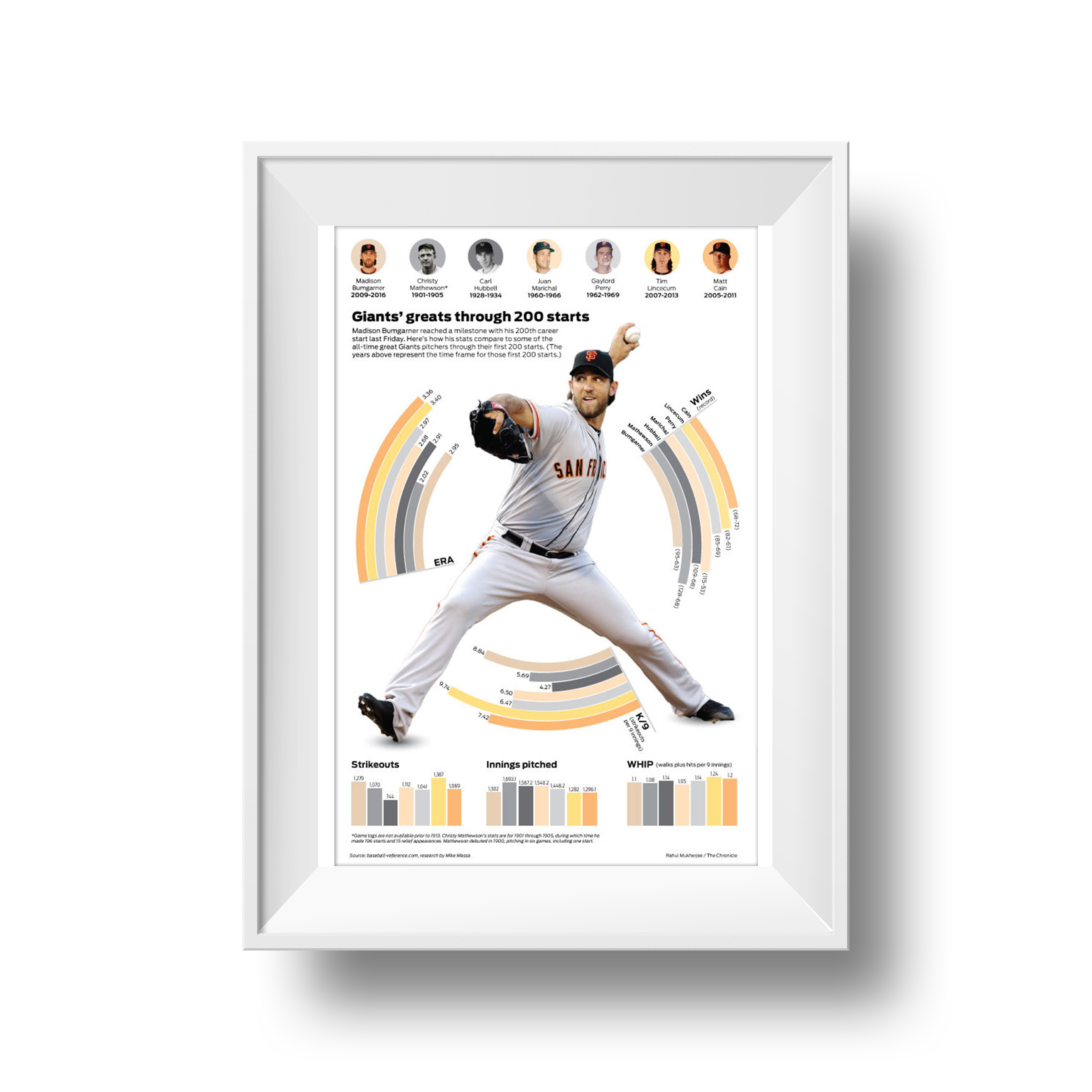
Giants' greats through 200 games
Madison Bumgarner is a three-time World Series Champion and was the MVP for his last win. I compared him to six other pitchers in Giant's franchise history.
Top 10 Vikings of All Time
I took a poll of more than 6,000 Vikings Fans and showed which players were the most popular.
The Gophers’ game changer
The University of Minnesota built a center where student athletes can go to study. I explained what is on each floor in each of the three buildings.
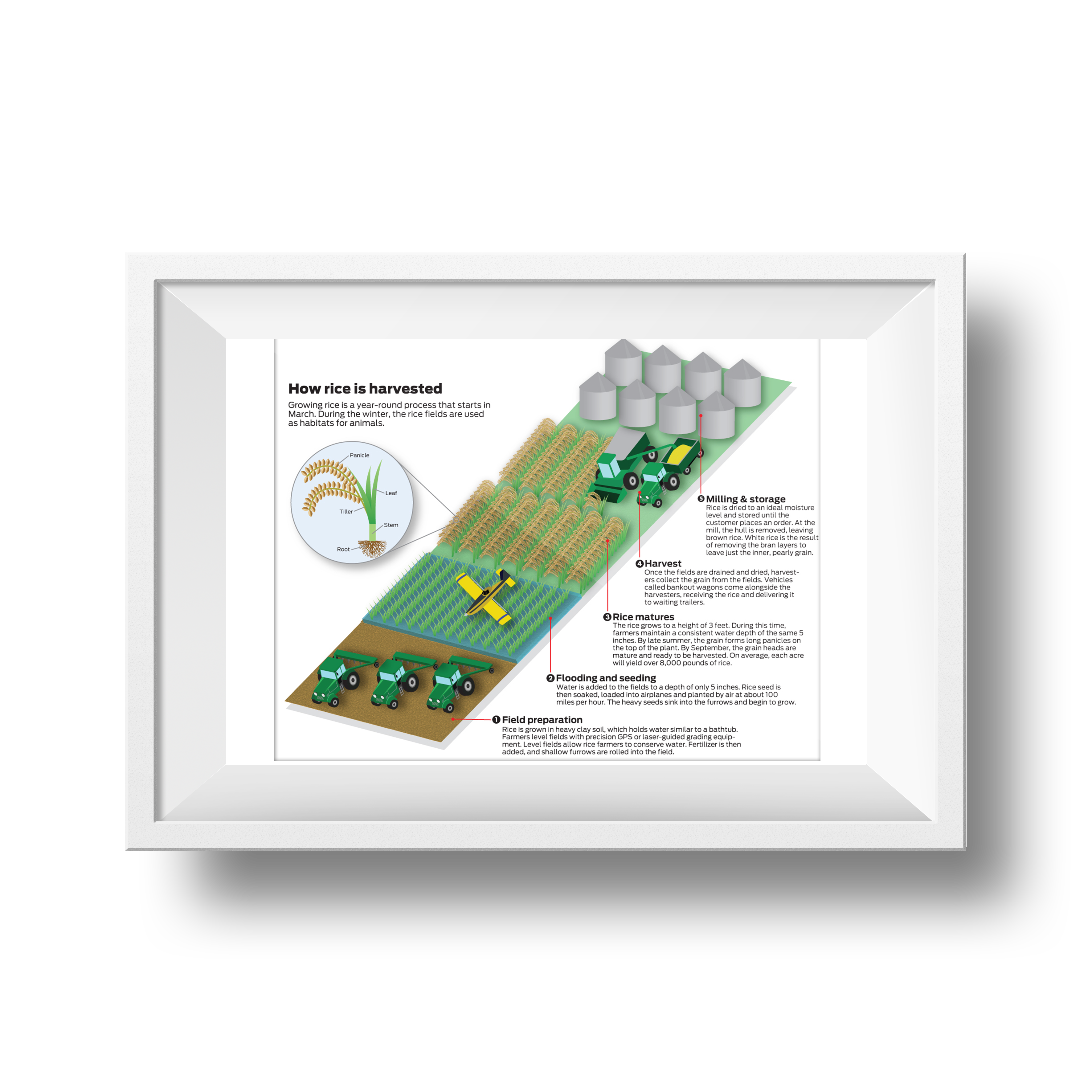
How rice is harvested
Rice production is becoming popular in Northern California. I drew out the process for how it grows.
Mayoral Calculus
Right after the election, The Star Tribune wanted to show how the votes broke down in the ranked-choice system. I helped convert the desktop graphic to mobile.